Alamo Drafthouse VR Experience
Welcome to the future of cinema-going with the Alamo Drafthouse VR Experience. In our reimagined virtual reality (VR) environment, movie enthusiasts can embark on an immersive journey that transcends the traditional theater experience. Whether opting for the convenience of a 72-hour rental or the excitement of a live showing, attendees can indulge in the magic of cinema from the comfort of their own homes. With the ability to order from Alamo's signature menu, the culinary delights of the theater are just a click away, enhancing the viewing experience. But what truly sets our VR experience apart is the opportunity to share the excitement with friends through watch parties, fostering a sense of community and connection even across distances.
Join us as we revolutionise the way audiences engage with movies, blending the best of technology, convenience, and camaraderie in the Alamo Drafthouse VR Experience.
University of Texas at Austin, Masters of Science in Information Studies (MSIS)
Course: INF 385T – Interaction Design
Professor: A. Fleming Seay
Team: Alex Locke, Jyotsna Vempati, Shatayu Mondhe, Madhav Varma and Shruthika Sridharan
If you prefer a condensed version of this report, you can access our final presentation through the link below.
Introduction
The Alamo Drafthouse VR Experience project aims to revolutionize the way audiences engage with cinema by leveraging immersive virtual reality technology.
With the traditional theater experience undergoing transformation, our goal is to offer a novel and convenient alternative that brings the magic of movies directly to the homes of viewers.
By providing both 72-hour rental and live showing formats, our objective is to cater to diverse preferences and schedules, ensuring maximum accessibility and flexibility.
Additionally, integrating Alamo's renowned menu into the VR environment aims to elevate the movie-watching experience, allowing attendees to savor their favorite snacks and meals from the comfort of their own space.
Central to our project is the objective of fostering social connections and shared experiences, facilitated through virtual watch parties that enable friends to enjoy movies together regardless of physical distance.
Through this innovative venture, we aspire to redefine the boundaries of cinematic entertainment and create lasting memories for audiences worldwide.
Problem Exploration
The traditional movie theatre experience has faced significant challenges in recent times, exacerbated by factors such as changing consumer preferences, technological advancements, and unforeseen circumstances such as the COVID-19 pandemic. These challenges include:
1. Accessibility and Convenience: Many moviegoers find it inconvenient to travel to theatres, especially considering factors like distance, traffic, and time constraints. Additionally, unforeseen circumstances such as the COVID-19 pandemic have highlighted the need for alternative viewing options that prioritise safety and comfort.
2. Social Engagement: Despite the inherent social aspect of movie-watching, traditional theatres often fail to facilitate meaningful social interactions, particularly for viewers separated by physical distance.
3. Culinary Experience: While theatres offer concessions, the variety and quality of food options may not always meet the expectations of discerning audiences. Additionally, the process of ordering and receiving food physically during screenings can disrupt the viewing experience.
4. Flexibility of Viewing Options: The rigid scheduling of theatrical showtimes may not align with the preferences and schedules of all moviegoers, leading to missed opportunities for engagement.
Addressing these challenges is crucial to not only sustain the movie theater industry but also to enhance the overall movie-watching experience for audiences.
Project Goals and Business Opportunities:
1. Enhanced Accessibility: Our primary goal is to provide audiences with a convenient and accessible alternative to traditional theatres. By offering the Alamo Drafthouse VR Experience, viewers can enjoy movies from the comfort of their own homes, eliminating the need for travel and overcoming geographical barriers.
2. Social Connection: Through virtual watch parties, our aim is to foster social connections and shared experiences among movie enthusiasts. By enabling friends to watch movies together in a virtual environment, we capitalize on the inherent social aspect of movie-watching, regardless of physical distance.
3. Culinary Indulgence: Integrating Alamo's signature menu into the VR experience presents an opportunity to enhance the culinary aspect of movie-watching. By offering a diverse selection of high-quality food and beverage options, we aim to elevate the overall viewing experience and cater to the preferences of discerning audiences.
4. Flexibility and Convenience: By providing both 72-hour rental and live showing formats, we aim to cater to the diverse preferences and schedules of moviegoers. This flexibility not only expands our potential audience but also maximizes convenience, ensuring that viewers can enjoy movies on their own terms.
In pursuing these goals, we not only address existing challenges within the movie theatre industry but also unlock new business opportunities by tapping into the growing demand for innovative and immersive entertainment experiences.
Overview
Why Alamo Drafthouse?
Alamo Drafthouse offers a wide variety of delicious meals, snacks, and drinks. It leads in customer loyalty, with a score of 72% on the Composite Loyalty Index. It also stands out for its seating options and the ability to reserve seats. Infact,
Alamo Drafthouse had the most concessions visits, indicating a positive customer experience.
Context
Traditional movie theaters have faced significant challenges due to the rise of streaming services and the impact of the COVID-19 pandemic. In response to these challenges, your team aims to innovate and transform the movie theater experience by leveraging Apple's Vision Pro technology. The goal is to create an immersive and digital platform that offers live virtual shows as well as on-demand viewing options.
Significance
Reviving the Industry:
By reimagining the movie theater experience, this project has the potential to breathe new life into an industry struggling to stay relevant in the digital age.
Meeting Consumer Needs:
Addressing the shift in consumer behavior towards on-demand entertainment while still providing the social aspect of a communal movie experience.
Innovating with Technology:
Leveraging cutting-edge technology like Apple's Vision Pro demonstrates a commitment to innovation and staying ahead of industry trends.
Creating New Revenue Streams: Introducing premium viewing options and partnering with food delivery services opens up additional revenue streams for theaters, potentially offsetting losses from traditional ticket sales.
Discovery Phase
Understanding User Painpoints
To address user pain points before, during, and after their movie theater experience, our VR solution offers immersive features that enhance convenience and comfort throughout every stage of the cinematic journey.Users will delight in the immersive elements of our VR experience, which capture the essence of what they enjoy most about the theater, from the communal atmosphere to the thrill of the big screen.
User Interviews
Through thorough user interviews, we've gained valuable insights into VR users' movie watching experiences, allowing us to tailor our VR solution to seamlessly integrate with and enhance their existing habits and preferences. By comparing VR movie watching experiences to those in physical theaters, we've identified key areas where our VR experience can offer unique advantages, such as customizable viewing environments and interactive elements.
Competitive Analysis
Our competitive analysis revealed a landscape dominated by two visionOS streaming platforms and one Meta Quest social movie watching experience, informing our strategy to differentiate our VR offering through innovative features and partnerships.
Partnership Evaluation
Through partnership evaluation, we've explored why certain prominent streaming companies have yet to embrace visionOS, uncovering potential barriers and opportunities for collaboration within the VR ecosystem.
Market Research
Market research highlights shifting trends between movie theaters and streaming services, influenced by the significant impacts of COVID-19 on consumer behavior, guiding our development of a VR experience that meets evolving entertainment preferences and expectations.
Problem Statement
Based on the Problem exploration and discovery phase, we divided our problem statement into 4 segments to better understand and tackle the problem
Who?
Loyal customers of Alamo Drafthouse and movie enthusiasts, as well as VR enthusiasts, face challenges accessing theaters and engaging in immersive movie experiences.
What?
These challenges include limited accessibility, frustrations with the theater environment, high costs, transportation difficulties, and conflicts with inflexible work and personal schedules.
When?
These issues are particularly prevalent when new movies release in physical theaters, exacerbating the obstacles faced by movie-goers.
Why?
The shift in watching habits towards home streaming has intensified the need for alternative movie-viewing options, prompting the rise in usage of VR technology to recreate the theater experience and meet the evolving needs of customers while staying aligned with market trends.
Our Solution
Based on the insights we uncovered and the problem statement, we identified an opportunity to bring the physical theatre to the virtual world.
Our vision is to craft an immersive experience that evokes the familiarity and nostalgia of traditional theatres while harnessing the advantages of modern streaming technology.
Design Process
Ideation
Our initial ideation involved mapping out a user journey to seamlessly integrate the new VR feature into Alamo Drafthouse’s existing app.
Understanding user needs at every step, we individually crafted unique versions of the journey by drawing insights from research. We then merged these to create a central flow aimed at optimizing the user experience.
Additionally, we visually represented task flows of the app’s current state and new flow to mimic the app’s functionality and also pinpoint the exact user path.
Crazy 8s
We employed the dynamic Crazy 8s exercise to tackle our design challenge collaboratively.
Each team member embarked on a rapid ideation journey, sketching eight unique concepts in just eight minutes.
We tried to sketch the entire flow/parts of the flow, in as much detail a possible in order to understand the requirements for the first wireframes we would design.
We then voted on the features we liked the most in each other’s sketches.
Based on the sketches we did as part of our crazy eight exercise we narrowed down some key features which would be important to include in the wireframes.
After we made the wireframes, we appear critique of the wire frames amongst our own group and came up with some interesting corrections which could be made to the wire frame before concept testing.
Wireframing
Based on the previous exercises, we came up with some wireframes which were then used for concept testing and peer critique to improve the product moving forward.
Mobile Wireframes
VR Wireframes
Concept Testing
After peer testing and iterations on the initial wireframes based on the peer critique, our team started with the process of concept testing which helped us get a direction moving forward.
Here’s what people said:
Positive feedback
• Users thought the concept is a really good idea.
• The social aspect of watching movies together was highly appreciated.
• The concept was seen as very different from traditional movie watching.
Confusion and questions
• Users were confused about the purpose of certain buttons and features.
• The friend selection process was confusing.
• Users were unsure about the difference between watching a movie and connecting to VR.
• Some users didn't understand the purpose of the “cooldown room”.
Suggestions for improvement
• Users suggested thinking more about concessions and making the process clearer.
• Some users recommended adding a reminder notice for ordering food.
• Users wanted clearer instructions on how to use VR and enhance the VR experience.
• Users suggested making the VR button more noticeable.
Mid Fidelity
Based on the previous exercises, we came up with some wireframes which were then used for concept testing and peer critique to improve the product moving forward.
Mid Fi - Mobile (Live Show)
Mid Fi - Mobile (72 Hour Rental)
Mid Fi - VR
User Testing
We asked users to perform a set of tasks in order to assess the usability of our prototype as a part of testing. Below is the summary of tasks that were performed by the users during this process -
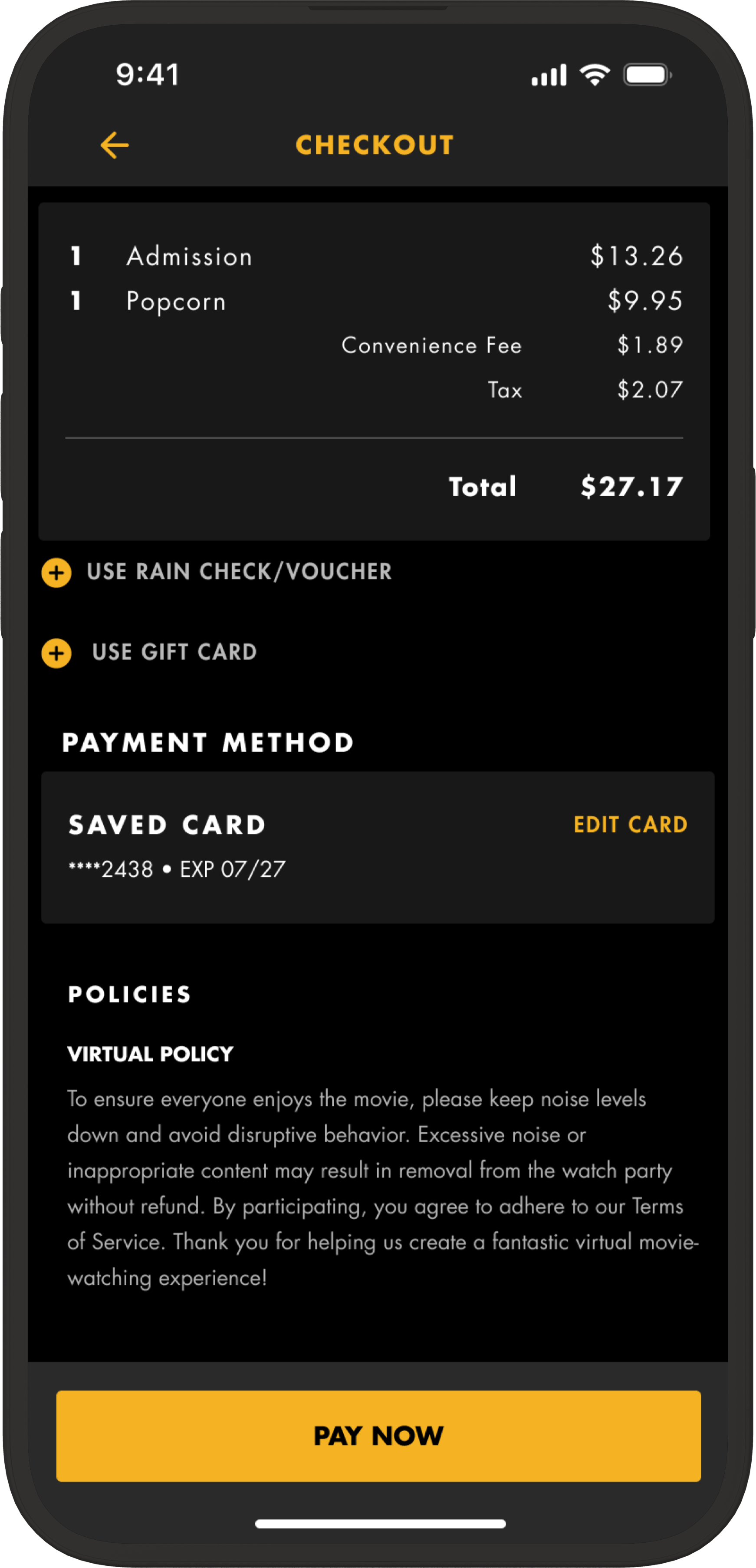
Task 1 : Navigate through the mobile app and purchase 1 ticket for "Dune 2" in Virtual Reality at 6:40 PM. Also, order popcorn and checkout.
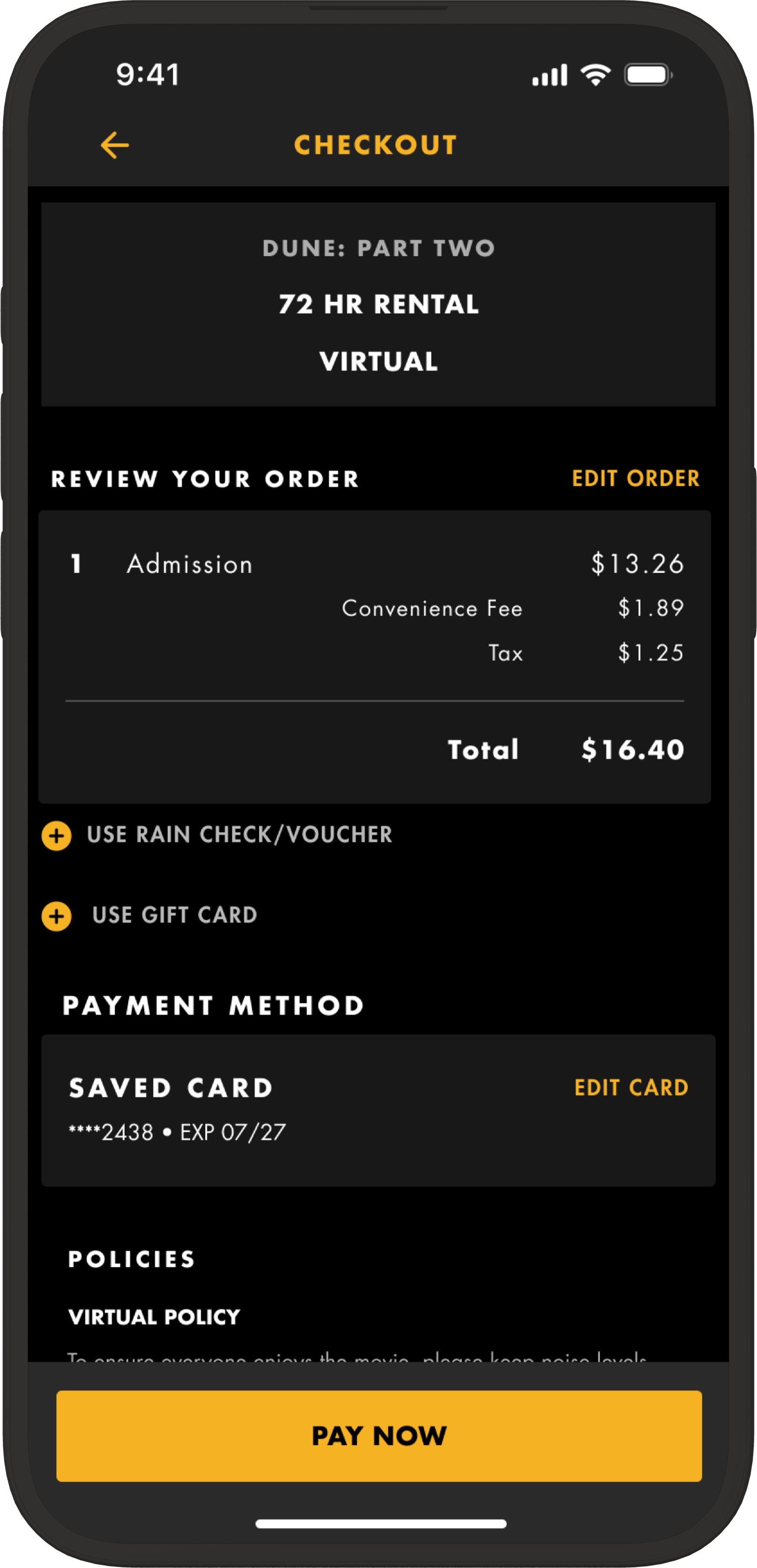
Task 2 : Rent the virtual movie for 72 hours and complete the checkout process.
Task 3 : From the ticket confirmation page, navigate to open the movie in your Virtual Reality headset and set-up to watch Dune 2.
Task 4 : Order food through the Virtual Reality app itself and begin watching the movie.
Stats from User Testing
Task Success Rate
We can see a similar trend with the Task Success Rate too. The overall success rate between round 1 & round 2 has improved.
If we look closer, the success rate for task 1 has fallen, but the success rate for the rest of the tasks reached 100%.
Ease of Task
Ease of task measures how easy the participants found the task to be.
The ease of task rating has fallen for task 1 and 4 between the 2 rounds and has improved for task 2 and 3.
While the numbers show an overall improvement of performance with the iterations we’ve done on our designs based on Round 1 feedback, our participant pool is not high enough to gauge if this is due to chance or if there are real issues.
Insights & Solution
During the mid-fidelity testing phase, several key insights emerged, shedding light on the user experience and informing design decisions. Firstly, participants demonstrated a strong preference for intuitive navigation, emphasizing the importance of clear and concise pathways throughout the interface. This underscores the significance of user-centric design principles, ensuring that users can easily accomplish their tasks without unnecessary friction. Secondly, feedback highlighted the crucial role of visual hierarchy in guiding user attention and facilitating efficient interaction. Incorporating these insights into the design process promises to enhance usability and optimize the overall user experience, ultimately leading to a more effective and engaging product.
Issue #1
Users struggled to locate the 72-hour rental option, feeling it should be more intuitively placed within the Date category.
In the original design, they must click the "Buy" button of a movie to find this option, rather than discovering it on the landing page where they expect date-related choices. This design flow seems counterintuitive to them.
The option to choose a time for the 72-hour rental added to the confusion, resulting in task abandonment, when it was an unrequired step.
Solution
The "72-hour rental" option is moved to the landing page within the Date category, aligning it with the expectation of an alternative option to choosing a specific date.
The time options are removed when users select the 72-hour rental to reinforce their confidence in their choice.
Issue #2
Users didn’t immediately recognize that they needed to select the checkbox to proceed with ordering food.
This is because the participants skimmed through the page and didn’t read the text until they scrolled a few times, leading to a failure to recognize the flow initiation point.
Solution
The Checkbox is removed so users can see the food offerings right away. This is More intuitive, and users can regocnize the feature without reading text.
Issue #3
Users didn’t understand the purpose of the access code or that they would need it later in the task flow.
Additionally, users struggled to locate the "Launch in VR" CTA button immediately, often scrolling past it multiple times before recognizing it.
Solution
The instructional text is made more explicit to inform users that they would need this code later on in the flow.
A share button and icon have been added to make the access code more easily accessible (e.g., send it to yourself or others).
The "Launch in VR" CTA has been made more clear and prominent to improve visibility and usability.
Issue #4
Users struggled to understand the concept of an access code and locate where to find it. This task required users to recall previous screens rather than immediately recognize what to do.
They also expressed a desire for clearer instructions to guide them on what to do.
Solution
The "72-hour rental" option is moved to the landing page within the Date category, aligning it with the expectation of an alternative option to choosing a specific date.
The time options are removed when users select the 72-hour rental to reinforce their confidence in their choice.
Issue #5
Users took a long time to recognize or didn’t recognize the icon they needed to click to view food options and place an order.
This is because users confused the popcorn icon with a trash icon.
Solution
The icon is changed to a ‘fork and knife’ to better represent the feature and make it obvious.
Additionally, an interactive, expandable menu for the icons is added to display text, making it more obvious so users don’t have to guess.
Issue #6
Users seemed to be unclear about the user flow and how the order placing process works in VR.
Some common questions revolved around how the food would be delivered to their house and whether it would be delivered while they were watching.
Solution
A question mark icon is added that users can click to access an instructional guide explaining how the process works in VR, aimed at answering frequently asked questions.
Iterations from User Testing (Hi-Fi)
Hi-Fi After User Testing (Live Show)
Hi-Fi After User Testing (72 Hour)
Hi-Fi After User Testing (VR)
Project Reflection
I. Initial thoughts and feelings about the VR project
Excitement and optimism:
We were thrilled to embark on a new adventure beyond the realms of website and mobile app design. The prospect of diving into the world of Virtual Reality (VR) filled us with excitement and optimism. It was an opportunity to explore the vast potential of VR technology and to learn the intricacies of designing immersive experiences. What added to our anticipation was the chance to collaborate with a larger team, bringing together diverse perspectives and expertise. We looked forward to the camaraderie and synergy that came from working alongside new team members, collectively shaping innovative VR solutions and pushing the boundaries of creativity.
Uncertainty and skepticism:
We felt uncertain about the time commitment and the need for a VR headset. There was skepticism about the feasibility of designing in VR without prior experience. We also felt uncertain about the availability of VR technology for testing and user feedback.
Collaboration and teamwork:
We had a positive experience working with familiar team members and learning from each other. Collaboration and good communication were key in deciding on the project idea. We felt confident and excited after finding ways to integrate Figma into VR software.
II. Lessons learned from the project
Unexpected challenges and successes:
As a team, we encountered both successes and challenges throughout our project journey. While the idea contributed positively to accessibility, we encountered pain points with closed captions and wheelchair accessibility. Font syncing issues posed setbacks in the design process, resulting in designs appearing different than intended. Despite these hurdles, our project provided valuable insights into the world of XR, enriching our understanding and paving the way for future endeavours in immersive technologies.
Learning about XR:
As a team, our project provided us with a valuable opportunity to delve into the world of XR. Through our work, we gained insights and experience in this emerging field, expanding our knowledge and skills in immersive technologies.
User testing insights:
Throughout our project journey, our team encountered various lessons and discoveries. We found that user testing videos were blurred due to settings, emphasizing the critical importance of pilot testing. Additionally, we experienced a significant shift in focus from business needs to user needs, which ultimately facilitated smoother design work. Encouragingly, reviews for our designs showed improvement between the two testing phases. However, we also learned that prototype limitations can significantly impact both user experience and testing data. Consequently, we recognized the value of conducting a concept test before diving into high-fidelity designs, a practice that helped us effectively prioritize features and refine our approach.
Focusing on main features:
Focusing on the main features proved to be advantageous for our team, as it enabled clearer communication of the idea and minimized the necessity to build out every edge case. This approach streamlined our development process and ensured that our core concepts were effectively conveyed to stakeholders and users alike.
III. Challenges faced in VR design project
Lack of experience and knowledge in VR:
A lack of experience and knowledge in VR posed a significant obstacle for our team, requiring us to invest time and effort in acquiring the necessary skills and understanding. Additionally, navigating the approach and crafting a final deliverable for our class proved to be challenging tasks. However, through perseverance and collaboration, we were able to overcome these hurdles and successfully meet our objectives.
Limitations of prototyping in VR:
Prototypes simulating reality presented limitations that posed challenges in accurately representing font sizing and other aspects of the design. Despite encountering font glitches along the way, our team had to accept them and move forward to meet project deadlines and objectives. These experiences taught us the importance of flexibility and adaptation in the face of unforeseen obstacles.
Difficulty in following design system guidelines:
Working with the new Apple Vision Pro design system presented challenges as it was unfamiliar territory, and there were instances where it was unclear if our designs aligned seamlessly within its framework. Additionally, emulating Alamo's brand and UI constrained our design exploration, limiting the creative avenues we could pursue. Despite these constraints, we navigated through the challenges, finding ways to adapt our designs effectively and ensure they met the required standards and objectives.
Time constraints:
The team faced time constraints that hindered their ability to work on additional features they wished to include in the project. Consequently, it was necessary to prioritize final designs and leave room for future iterations to accommodate the limited timeframe. Despite the challenges posed by time constraints, the team remained focused and adaptable, ensuring that the project progressed smoothly towards its goals.
Font sizing issues:
During testing, users encountered difficulty with small fonts in the VR prototype. However, subsequent testing in a personal VR headset revealed that the fonts were not actually too small, indicating a discrepancy between the prototype and real-world experiences. Despite encountering font glitches, the team had to acknowledge them and proceed forward, prioritizing other aspects of the project to ensure progress and success. These experiences underscored the importance of thorough testing and validation in refining the design process.
Lessons Learned
User testing process improvements:
Blurring videos proved unnecessary for user testing, highlighting the importance of refining testing protocols to align with actual user needs and experiences. Conducting a pilot test before setting up all tests emerged as a valuable practice to ensure that testing environments and procedures were correctly established, minimizing potential errors and maximizing the effectiveness of subsequent tests. Moreover, recognizing the importance of preventing issues with fonts emerged as a key takeaway, emphasizing the need for proactive measures to address font-related challenges and enhance the overall user experience.
Communication and coordination:
Getting everyone's schedules upfront proved to be invaluable for coordination, streamlining the process and ensuring that meetings and tasks could be scheduled efficiently. Utilizing Notion for collecting contact information was beneficial, although space limitations were encountered, prompting the need for creative solutions to accommodate the data effectively. Creating an ongoing Zoom meeting and integrating it into the Notion home page emerged as an effective strategy for facilitating meeting coordination and providing easy access to team members. However, the timeliness of responding to messages was identified as an area for improvement, highlighting the importance of prompt communication to maintain project momentum and efficiency.
Equipment and resources:
Demoing the new Apple Vision Pro at the Apple Store could have offered a more immersive understanding of the experience, providing valuable insights for incorporating the design system effectively. The availability of more than one VR headset would have facilitated testing of watch parties and collaborative design in ShapesXR, enhancing the breadth and depth of user testing scenarios. Additionally, attending a movie at the Alamo Drafthouse would have provided a firsthand experience of the theater environment, enriching the team's understanding of user needs and preferences. Working in one FigJam and one Figma file emerged as a practical approach for maintaining organization and coherence throughout the design process, streamlining collaboration and minimizing confusion.
Showcasing
Final designs and prototypes.
Live Showing:
Flow for purchasing tickets for a live virtual showing on the Alamo Drafthouse Mobile App.
72-Hr Rental:
Flow for purchasing tickets for a 72-hr virtual rental on the Alamo Drafthouse Mobile App.
VR Entry Point:
Flow for entry into the Alamo Drafthouse in VR landing you on the Film Hub page.
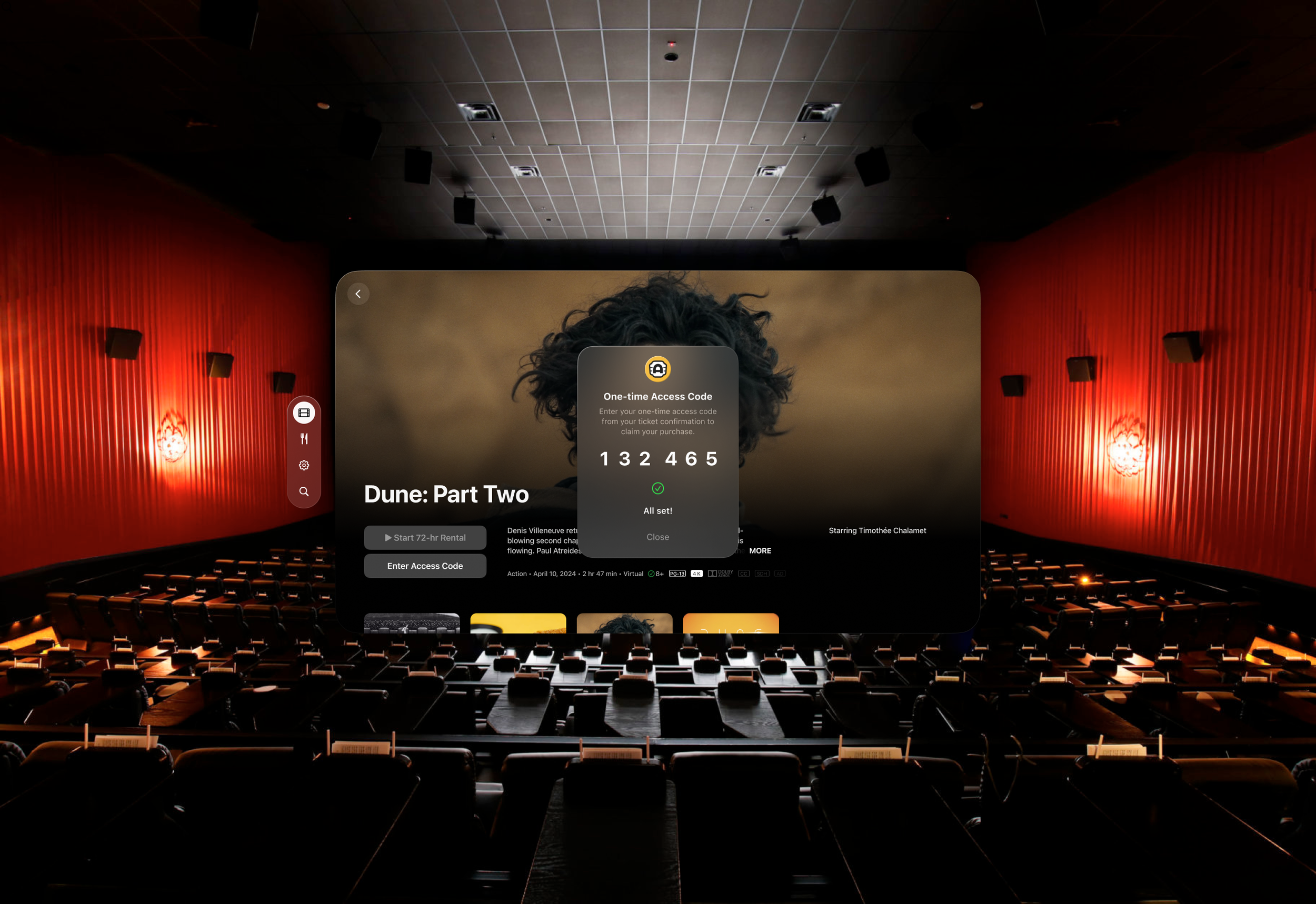
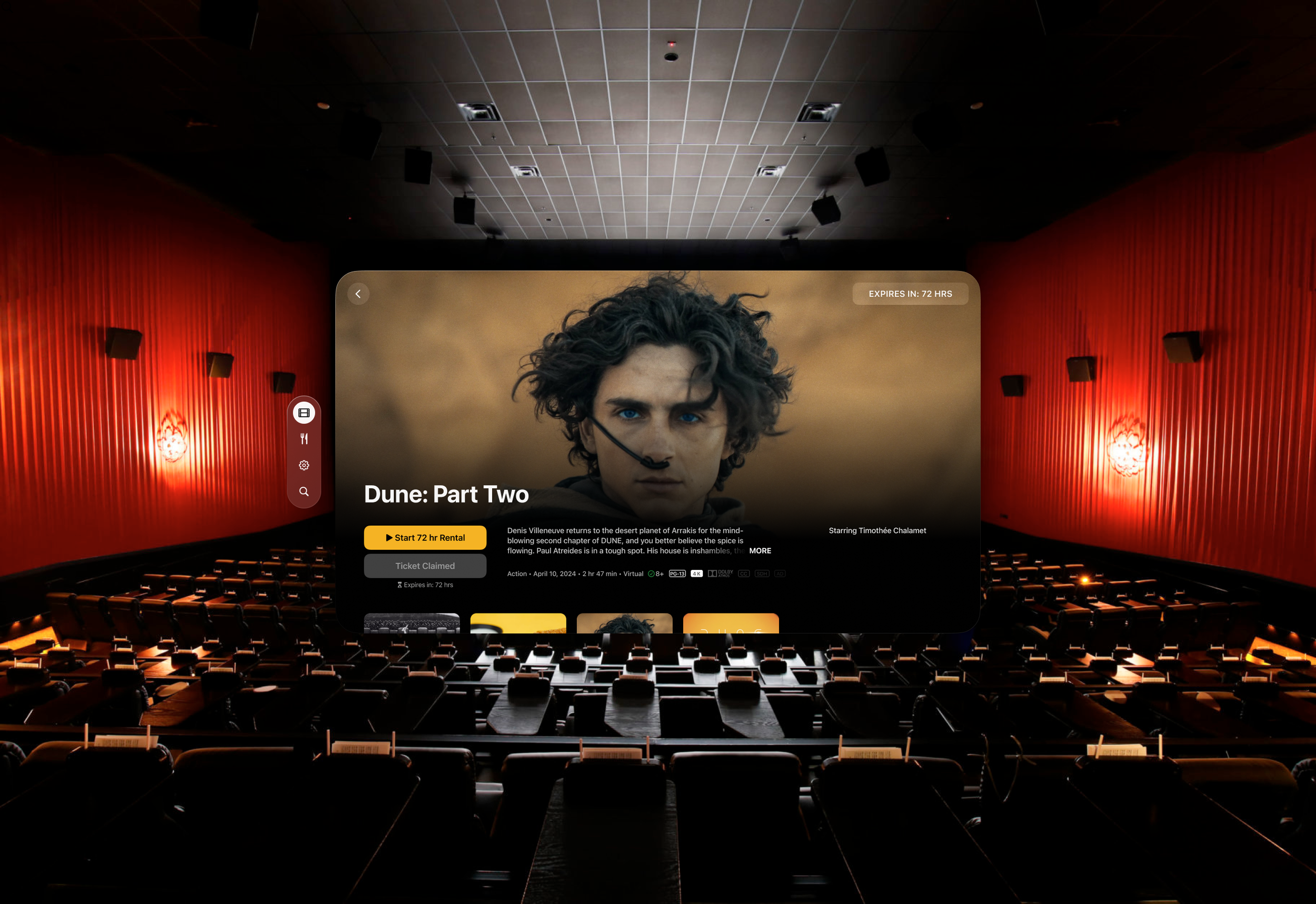
One-time Access Code:
Flow to enter the one-time access code to claim your ticket purchase.
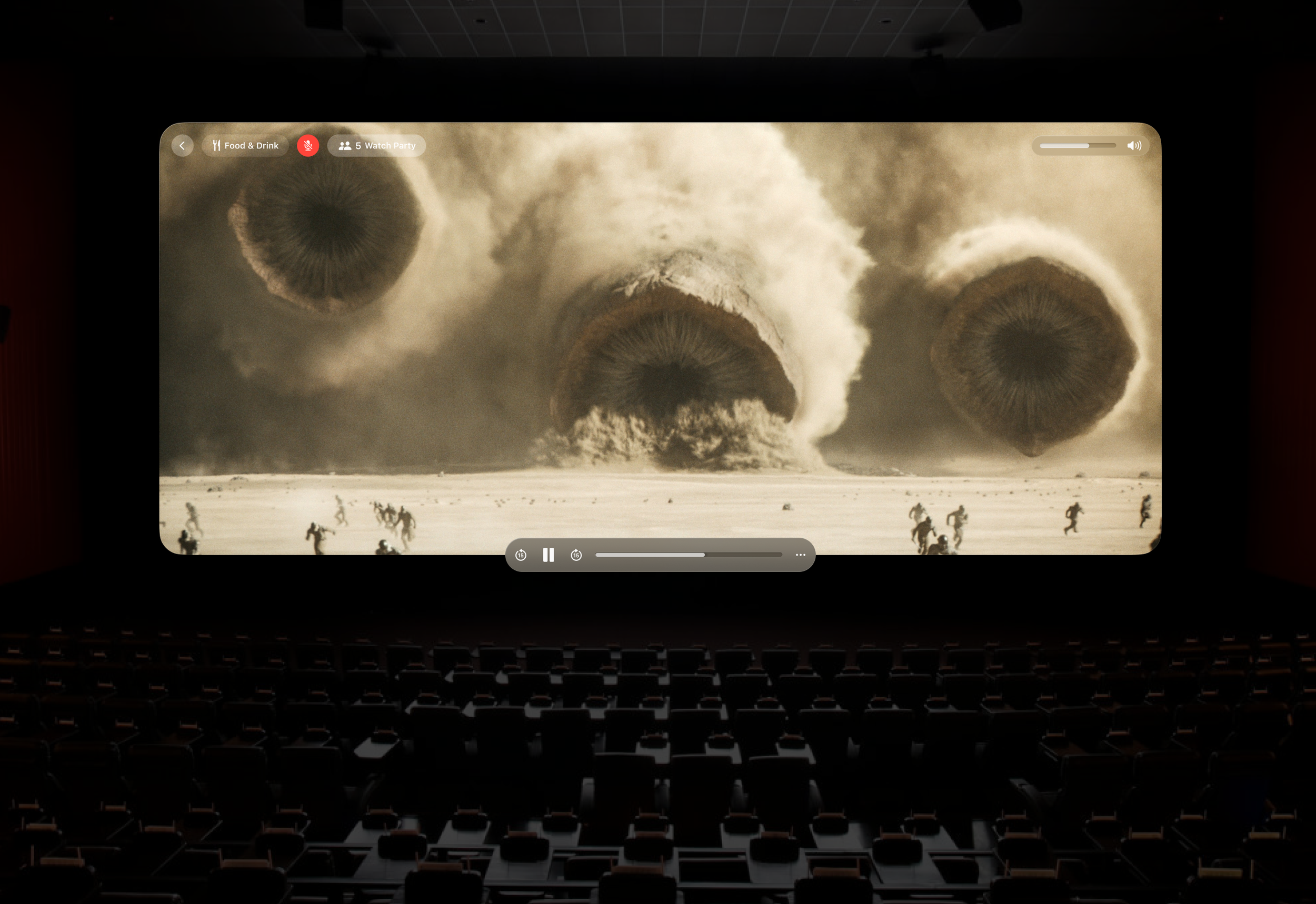
Movie Watching Experience:
Flow of the movie watching experience.
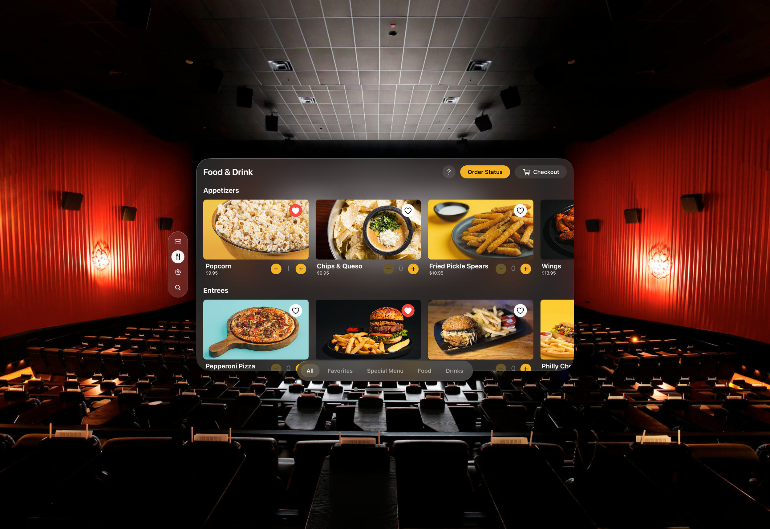
Order Food & Drink:
Flow of ordering food delivery from the Alamo Drafthouse to the comfort of your home.
Appendix
Executive Summary: Concise overview of the entire project.
Schedule: Timeline of project milestones and activities.
Appendices: Additional resources, artifacts, or supplementary materials.
Youtube videos of the prototypes
User tests
